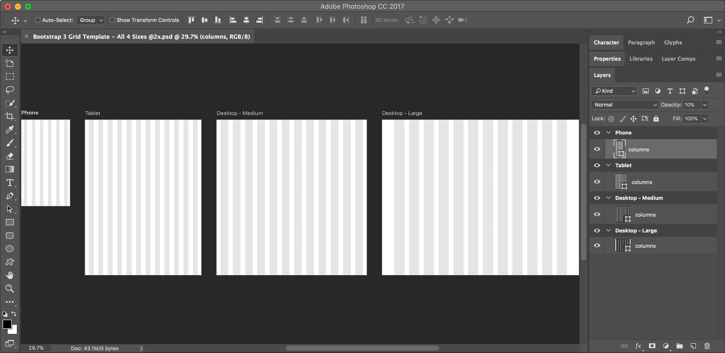
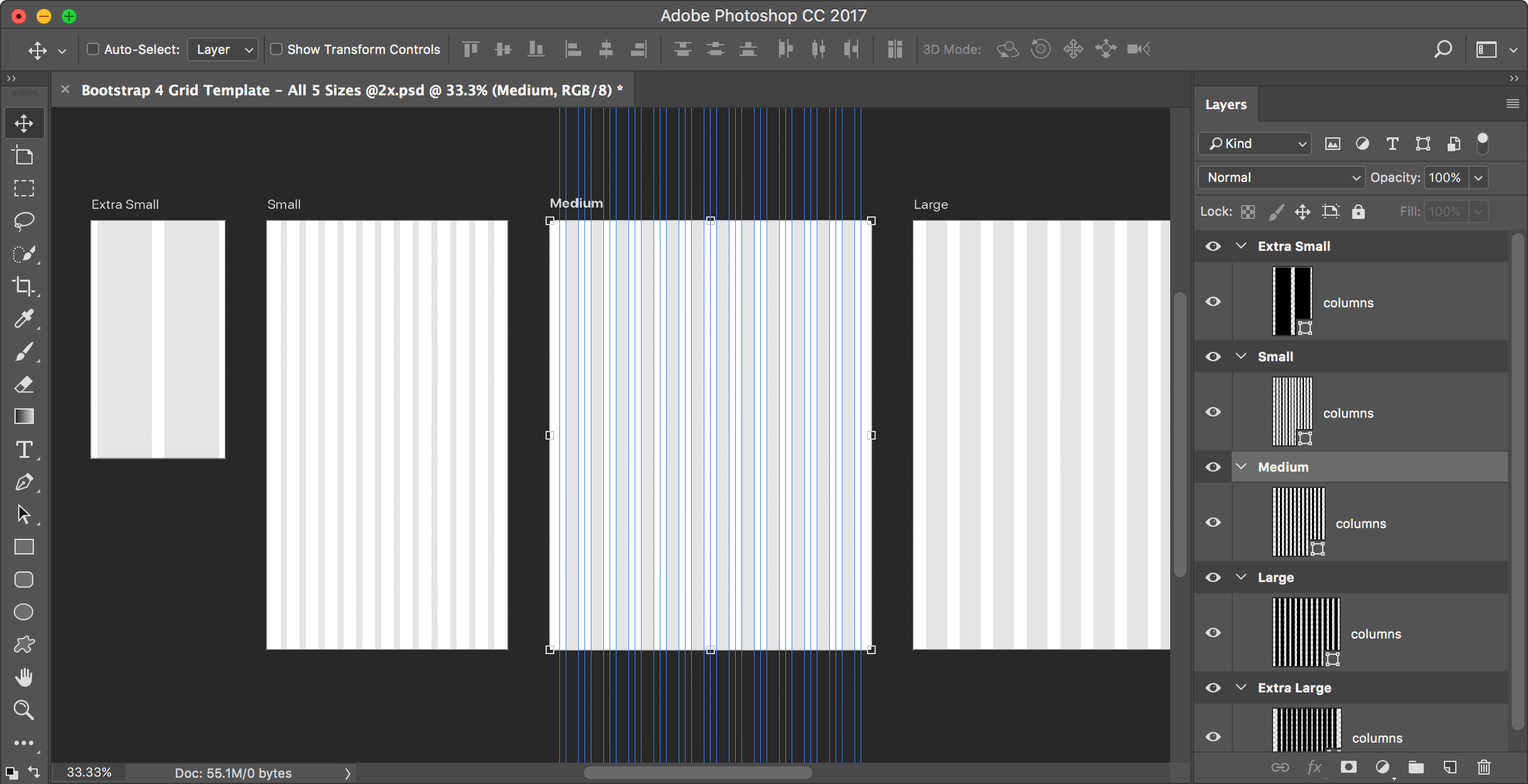
Photoshop Bootstrap 4 Grid Template using Artboards: Free Download
I could not find a Bootstrap grid for Photoshop that uses artboards, so I made one. I hope you like it! Artboards require Photoshop CC, so this won’t work in CS6 or older.
I could not find a Bootstrap grid for Photoshop that uses artboards, so I made one. I hope you like it! Artboards require Photoshop CC, so this won’t work in CS6 or older.
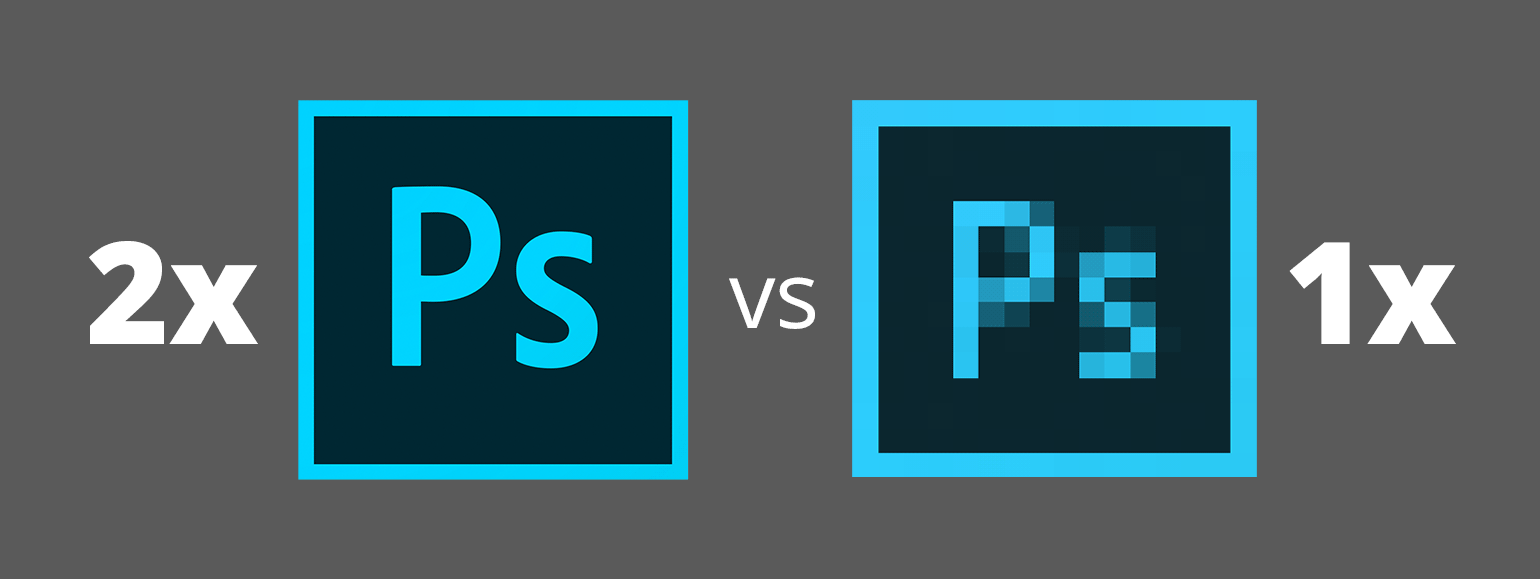
I’ve seen many web designers who work at 1x and I’ve read articles that say it’s best to design at 1x. But I think a more modern workflow is to work at 2x (Retina) size. In this article I’ll explore the various issues affecting our workflow, so you can understand why I recommend designing at 2x.
Let me clarify something before getting started. I’ll only talking about designing web graphics in Photoshop. Other apps like Sketch, Adobe XD, or Illustrator work totally differently, so this article will only focus on Photoshop.
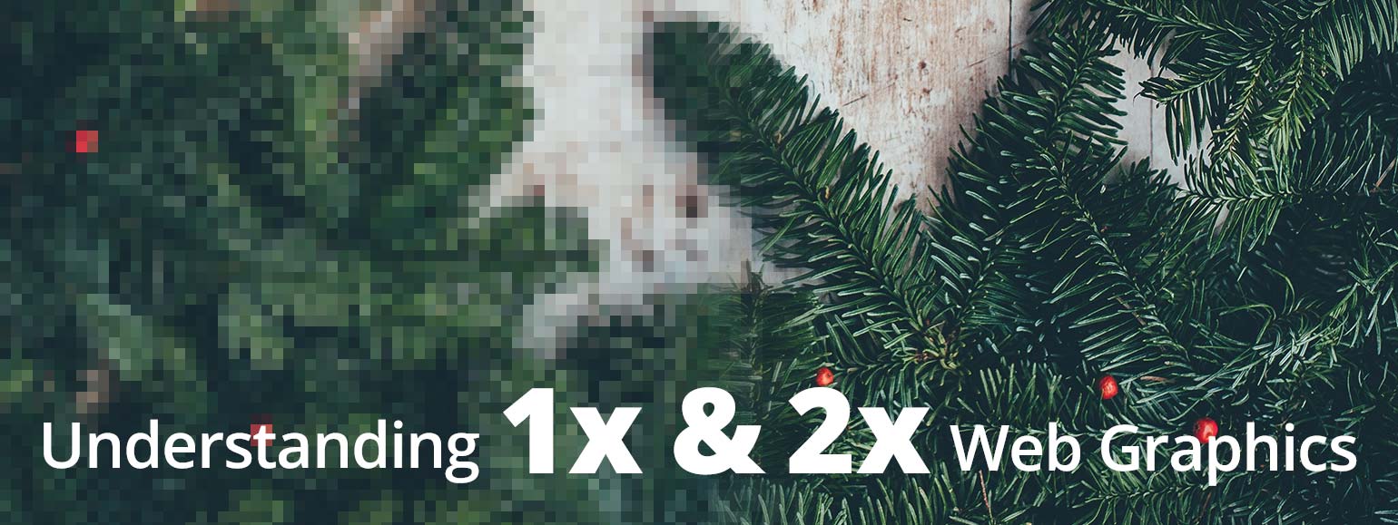
If your unsure of what I mean by 1x and 2x, please read my post: Retina Web Graphics Explained.
I find that many designers (especially those coming from print) don’t really understand how resolution works on the web, so I’d like to explain it. These concepts apply to whatever design app you use (Photoshop, Sketch, Adobe XD, Illustrator, etc.) and understanding this will help you create properly sized web graphics.
If an image will be coded into a space of 300 pixels, you have to make:
In a webpage, both images will be coded so they appear physically the same size, but the 2x image has more pixels squeezed into that space (so it appears sharper and more detailed).
NOTE: The resolution you see in Photoshop (such as 72ppi) is ignored by web browsers and is therefore irrelavent. It does not matter what the resolution is set to (so just make it 72ppi). All that matters is the pixel width and height of your images!
At the bottom of Photoshop’s Export As dialog (found in File > Export) there is an icon to the left of the zoom  that has no tooltip when you mouse over it. Depending on the image you might not see any effect if you click it. It’s a pretty cryptic icon, so what does it do?
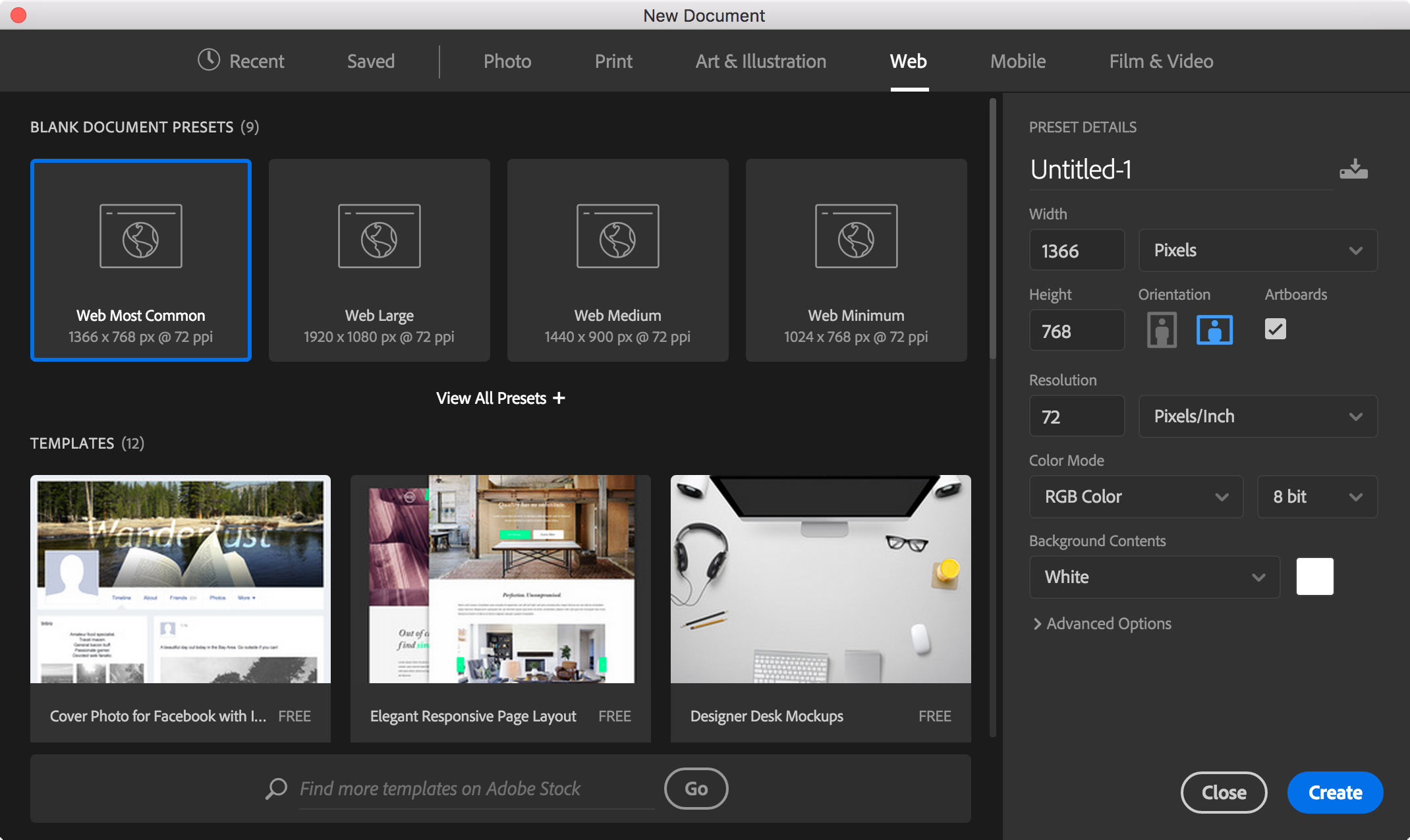
In CC 2017, Adobe completely redesigned Photoshop’s File > New dialog, but it’s slow to open and not as nice to use. The useless thumbnails are large, while the written specs (which are the most important thing) are smaller and harder to scan.
Luckily there’s a way to get the previous dialog back! (This also works in Adobe Illustrator.)
I could not find a Bootstrap grid for Photoshop that uses artboards, so I made one. I hope you like it! Artboards require Photoshop CC, so this won’t work in CS6 or older.