I find that many designers (especially those coming from print) don’t really understand how resolution works on the web, so I’d like to explain it. These concepts apply to whatever design app you use (Photoshop, Sketch, Adobe XD, Illustrator, etc.) and understanding this will help you create properly sized web graphics.
Quick Explanation
If an image will be coded into a space of 300 pixels, you have to make:
- A 300 pixel wide image (for 1x displays).
- A 600 pixel wide image (for 2x displays).
In a webpage, both images will be coded so they appear physically the same size, but the 2x image has more pixels squeezed into that space (so it appears sharper and more detailed).
NOTE: The resolution you see in Photoshop (such as 72ppi) is ignored by web browsers and is therefore irrelavent. It does not matter what the resolution is set to (so just make it 72ppi). All that matters is the pixel width and height of your images!
Detailed Explanation
We can best understand this topic by looking back at how web graphics started. Years ago (before hi-res screens were ever invented) we designed websites for displays that gradually grew bigger over the years. Early displays were 640 by 480 pixels, later growing to 800 by 600, 1024 by 768, and so on.

More pixels typically meant physically larger displays so you can see more stuff. This also meant the effective resolution of displays remained mostly the same.
The First Retina Display
The displays of the iPhone 3 and iPhone 4 were both physically the same size, but the iPhone 3 was 320 pixels wide and the iPhone 4 was 640 pixels wide. The iPhone 4 had twice as many pixels (widthwise), so we call it a 2x display. Apple calls them Retina displays because the human eye can’t see anything higher resolution than these displays. The old concept of more pixels equals a bigger screen no longer applied! Now the additional pixels were being used to show more detail, rather than more stuff (as you’d see on a bigger screen).

When I first heard about this, I wasn’t sure how it would work. If I had designed a webpage to be 320 pixels wide (which used to be the full width of an iPhone 3) would it now only be half the width of the iPhone 4 screen? That wouldn’t be good, because the content would be too small at half the size! Luckily that wasn’t the case, because the 320 pixels that are coded into HTML/CSS no longer have a one-to-one relationship with all displays:
- On 1x displays: 1 pixel width in HTML/CSS = 1 pixel wide on screen
- On 2x displays: 1 pixel width in HTML/CSS = 2 pixels wide on screen
The browser knows the resolution of the display, and translates HTML/CSS pixels into hardware pixels.
So Not All Pixels Are the Same Size!
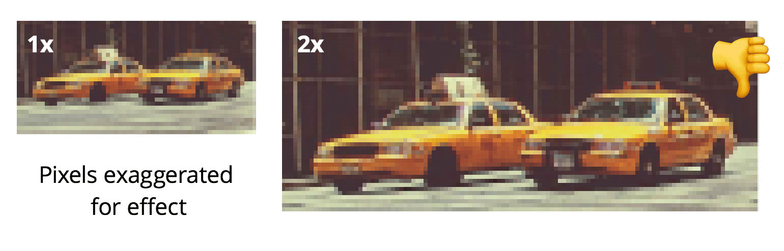
2x graphics are twice the pixel width of 1x graphics, but don’t think of them as bigger. They must occupy the same physical space, so the 2x pixels end up being smaller.
In the animation below, when the 2x image is twice the width of the 1x, both images have the same size pixels. This is not how we’re supposed to compare them! When the 2x image is scaled down so it’s the same physical size as the 1x, the pixels are smaller which creates a higher resolution image. This is the size the 2x image is supposed to be!
The Fluid Nature of Resolution on the Web
One last concept to keep in mind, is that resolution on the web is not always fixed. For example, an image’s resolution will change as it is scaled down to fit smaller devices. The resolution you see in Photoshop (such as 72ppi) is ignored by web browsers because the size of the image in the webpage determines its resolution. The size is determined by HTML/CSS code, so:
- A 1200px wide image, coded 1200px wide is 1x (low-res).
- A 2400px wide image, coded 1200px wide is 2x (hi-res).
- A 1200px wide image coded to be 100% of a browser window will be low or hi-res depending on the size of the window. It’s a fluid resolution!
To further illustrate this, I made a demo page with different sized images. You’ll need to view it on a desktop monitor (ideally 1200px or wider).
Should You Make Both 1x and 2x Graphics?
Most (if not all) of today’s mobile phones and tablets have 2x or higher resolution screens, so you may not need to create 1x graphics for mobile.
Some laptops and desktops have 2x screens, but most are still 1x. Therefore it’s best to create both 1x and 2x for desktops.
Should You Make 3x Graphics?
There are even higher resolution 3x displays, but they don’t look better than 2x because of the limitations of your eye. Some people with lower vision can’t even tell the difference between 1x and 2x! For web graphics, 2x is the highest resolution you need. Anything greater than 2x will increase the filesize (and download time) without a noticeable improvement in visual quality.
Conclusion
I hope this clarified (pun intended) how resolution works for web graphics, so you can be confident in making your graphics the correct size and resolution.